(Lightning Web Component) for each
HTML
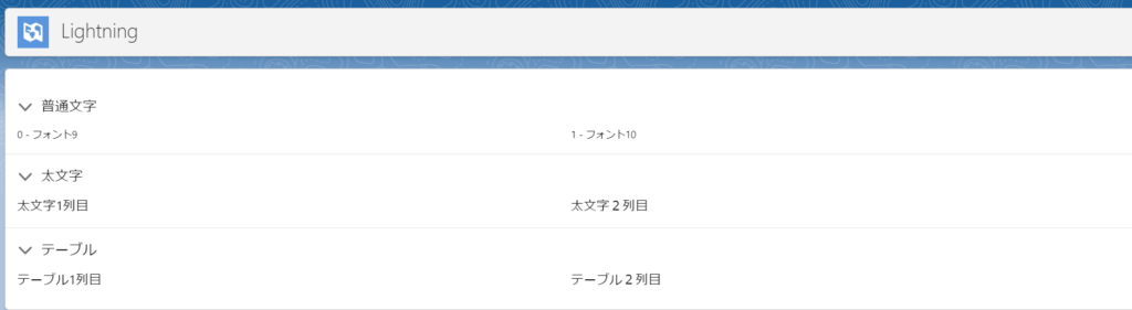
<template>
<lightning-card>
<lightning-accordion active-section-name={activeSections} allow-multiple-sections-open >
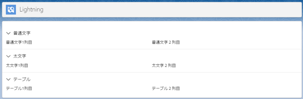
<lightning-accordion-section label="普通文字" name="1">
<lightning-layout multiple-rows>
<template for:each={fontList} for:item="item" for:index="index">
<lightning-layout-item size="6" key={item} class={item.class} >
{index} - {item.label}
</lightning-layout-item>
</template>
</lightning-layout>
</lightning-accordion-section>
<lightning-accordion-section label="太文字" name="2">
<lightning-layout multiple-rows>
<lightning-layout-item size="6">
太文字1列目
</lightning-layout-item>
<lightning-layout-item size="6">
太文字2列目
</lightning-layout-item>
</lightning-layout>
</lightning-accordion-section>
<lightning-accordion-section label="テーブル" name="3">
<lightning-layout multiple-rows>
<lightning-layout-item size="6">
テーブル1列目
</lightning-layout-item>
<lightning-layout-item size="6">
テーブル2列目
</lightning-layout-item>
</lightning-layout>
</lightning-accordion-section>
</lightning-accordion>
</lightning-card>
</template>
JS


import { LightningElement } from 'lwc';

export default class FontSample extends LightningElement {

    activeSections = ['1', '2', '3'];

    fontList = [
        {
            label: 'フォント9',
            class: 'size_9',
        },
        {
            label: 'フォント10',
            class: 'size_10',
        },
    ];
}
CSS

.size_9 {
    font-size: 9px !important;
}
.size_10 {
    font-size: 10px !important;
}
結果